Condemned - Design Bible Project
Early development, illustrations, and book layout


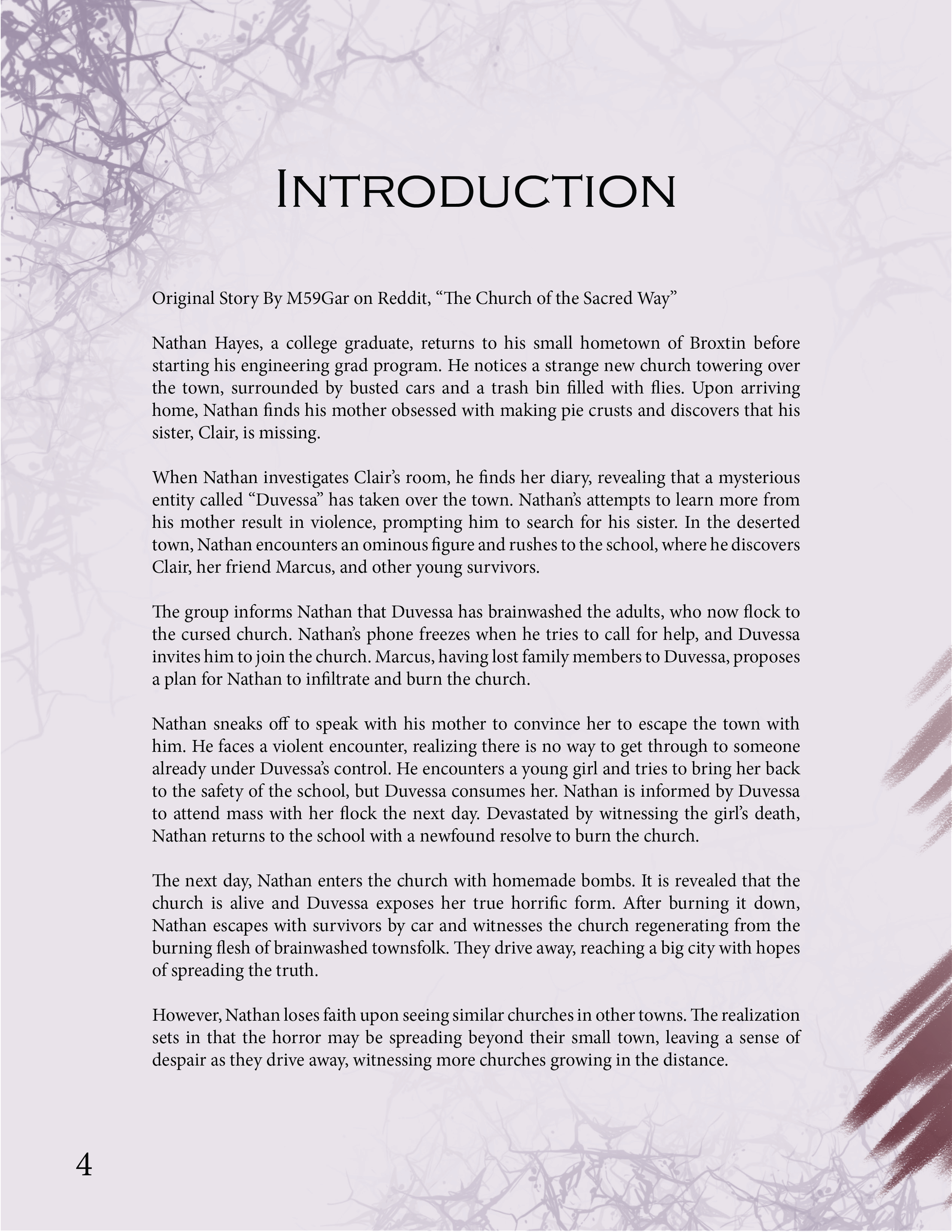


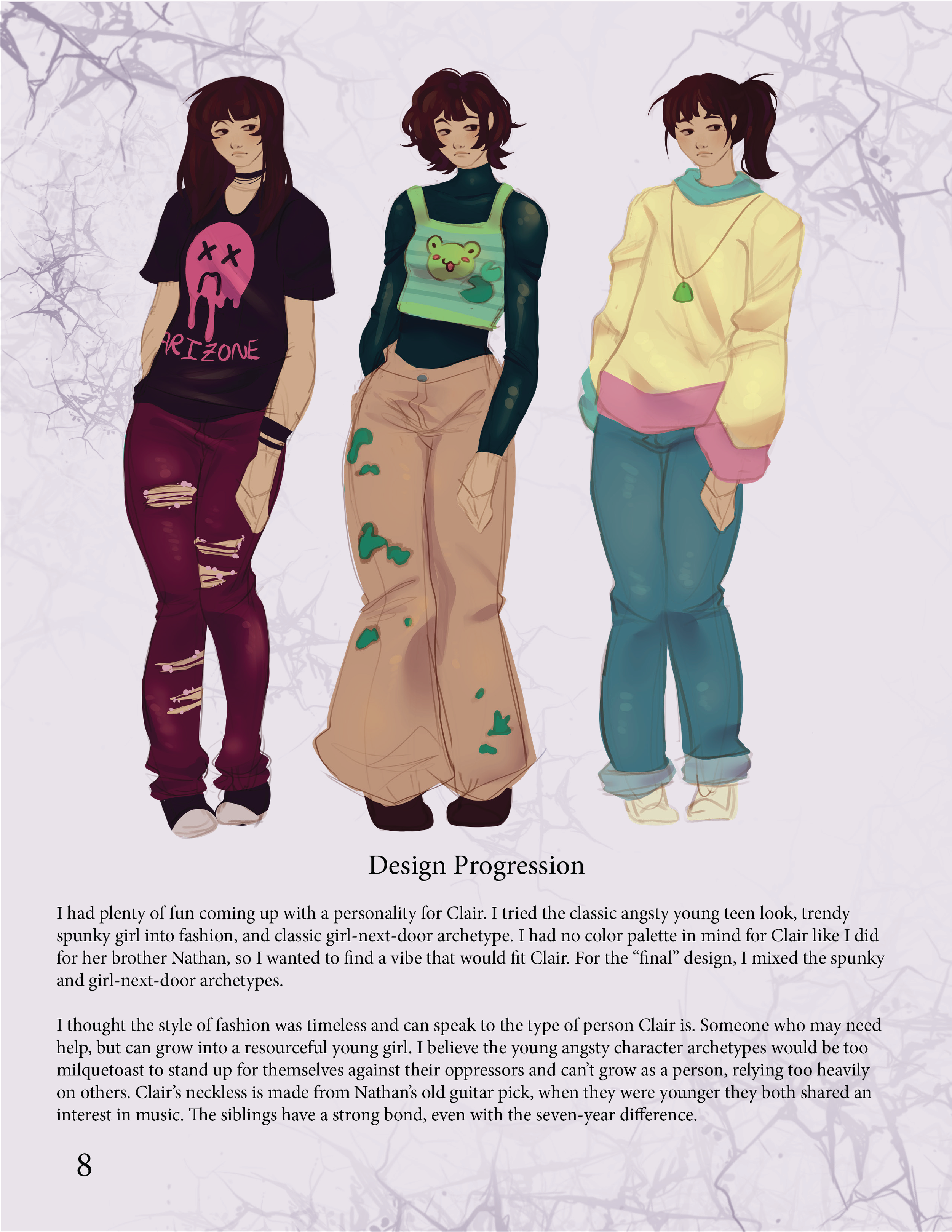
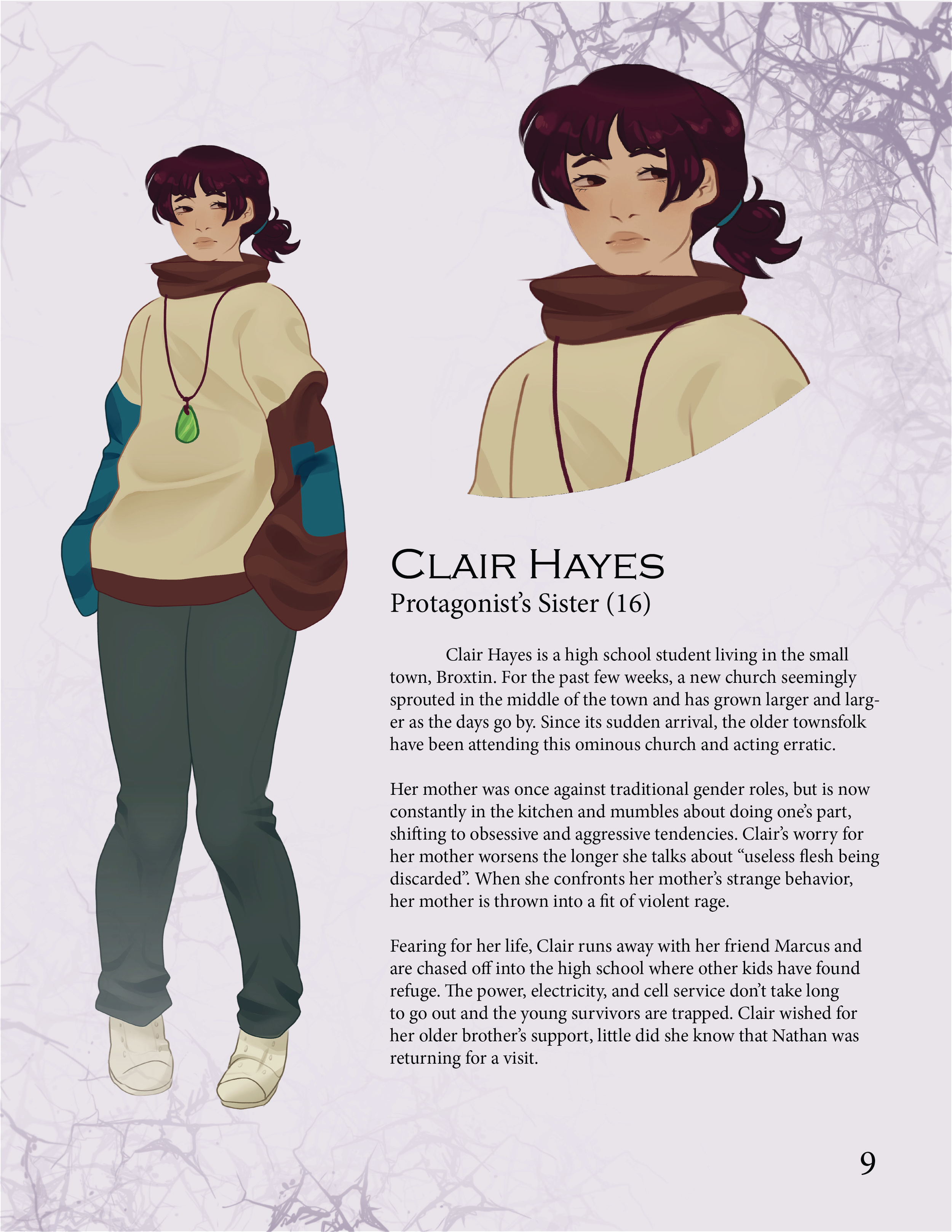


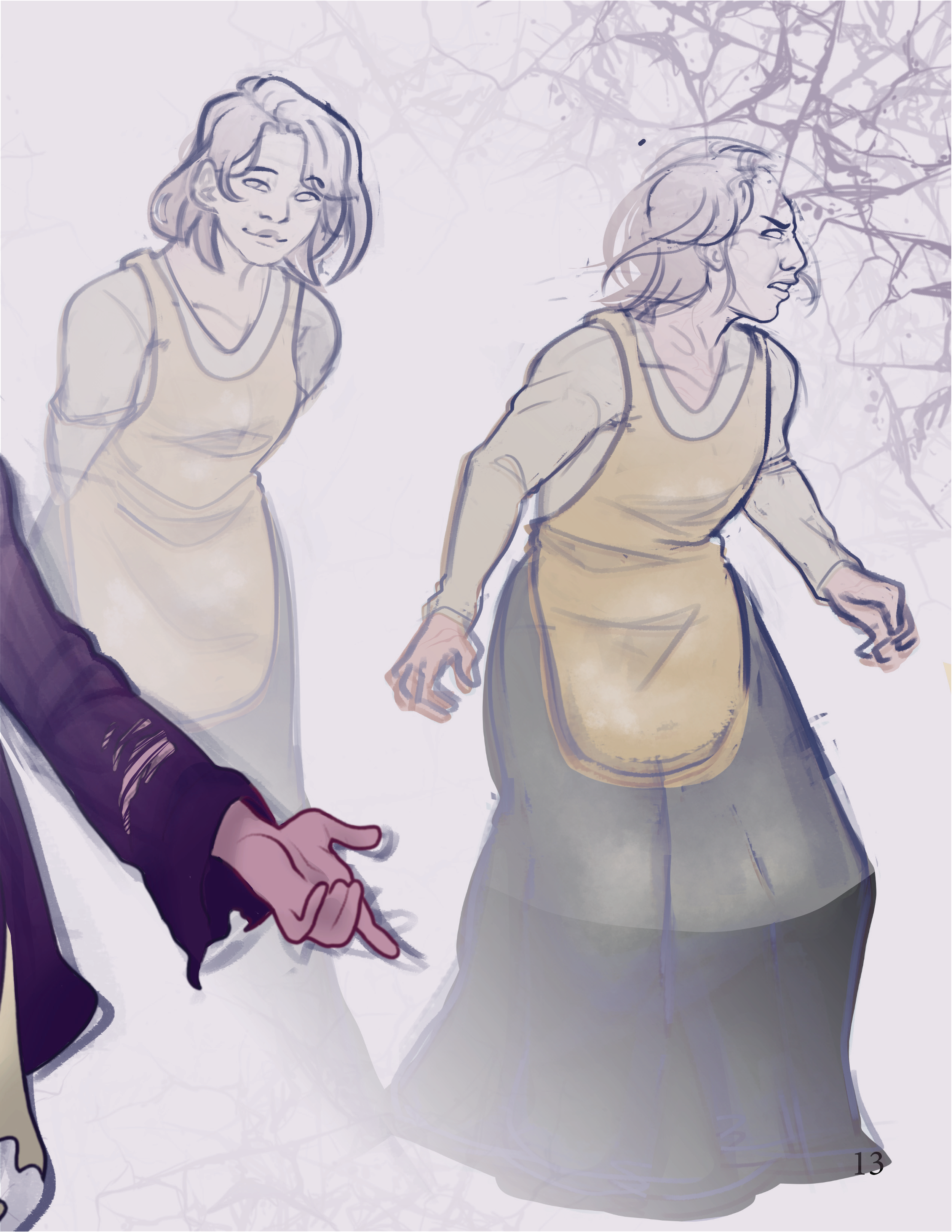




The Start of Development
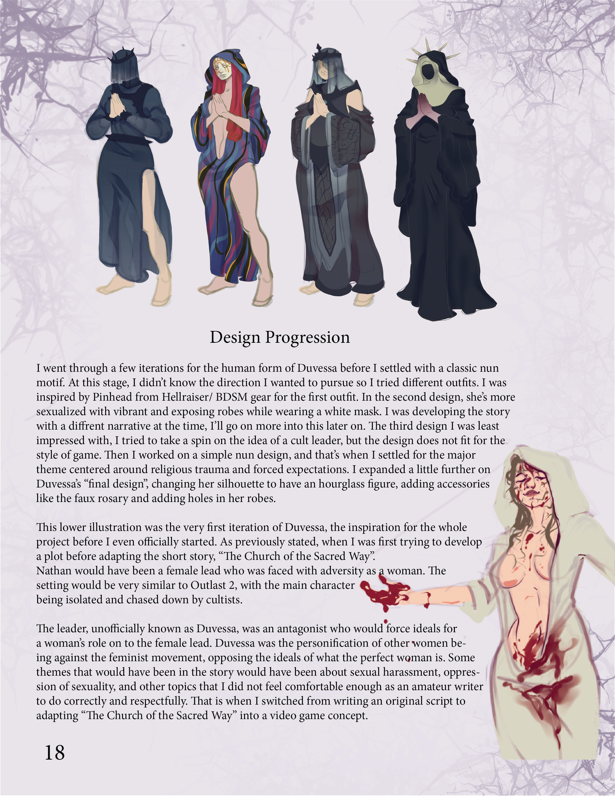
I wanted to try concept design around the horror genre for my senior project. Before I had a concrete idea of a story to base the concept art around, I sketched a simple cult leader figure covered in blood (as seen next to this paragraph), before deciding on a survival horror story with religious and cultic visuals. I tried creating an original story for my project, but that was proving difficult because of the harsh deadlines. I found a short horror story online called "The Church of the Sacred Way" by u/M59Gar (Matt Dymerski) on Reddit.com. I thought it would make a great basis for a video game pitch.
Condemned V.1
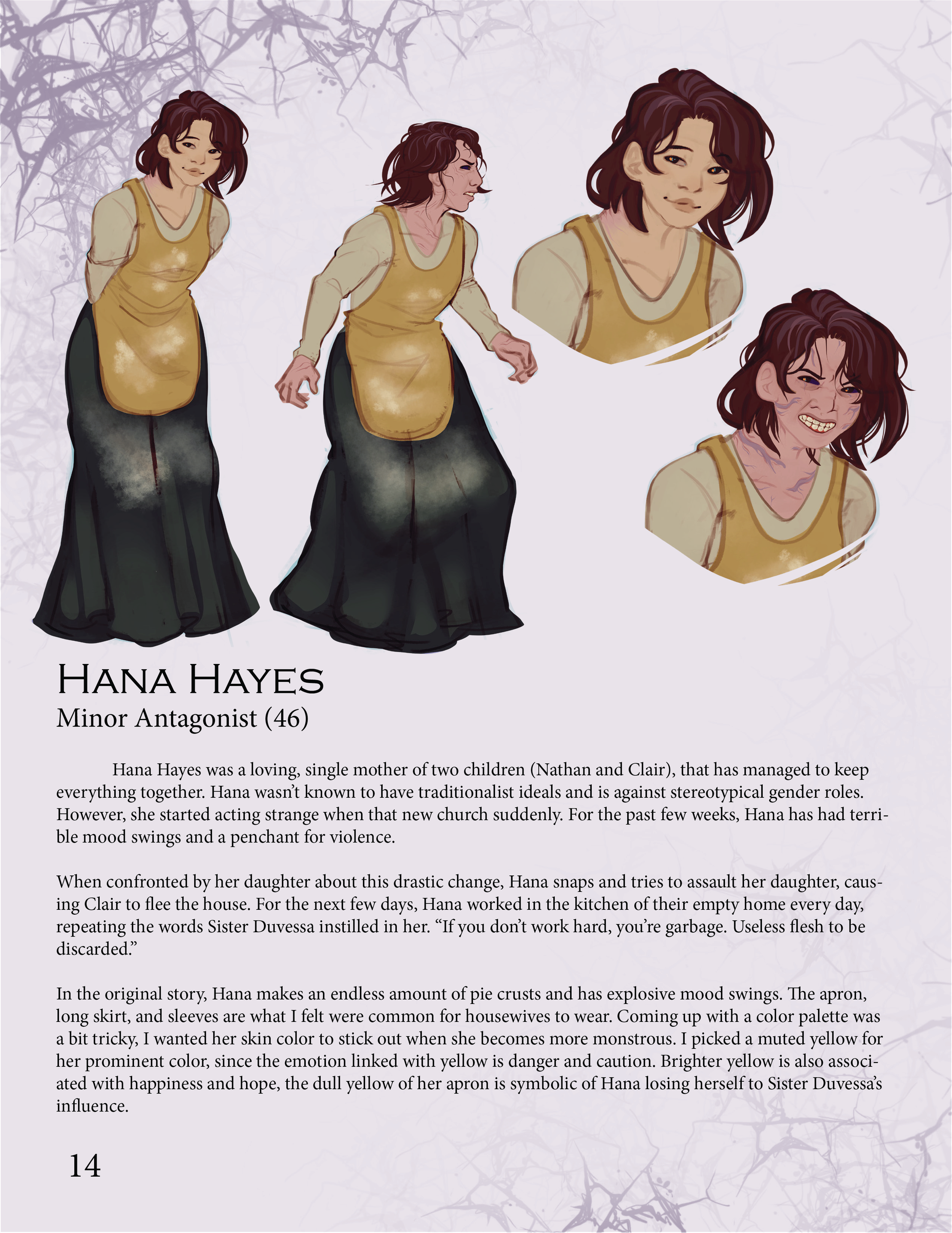
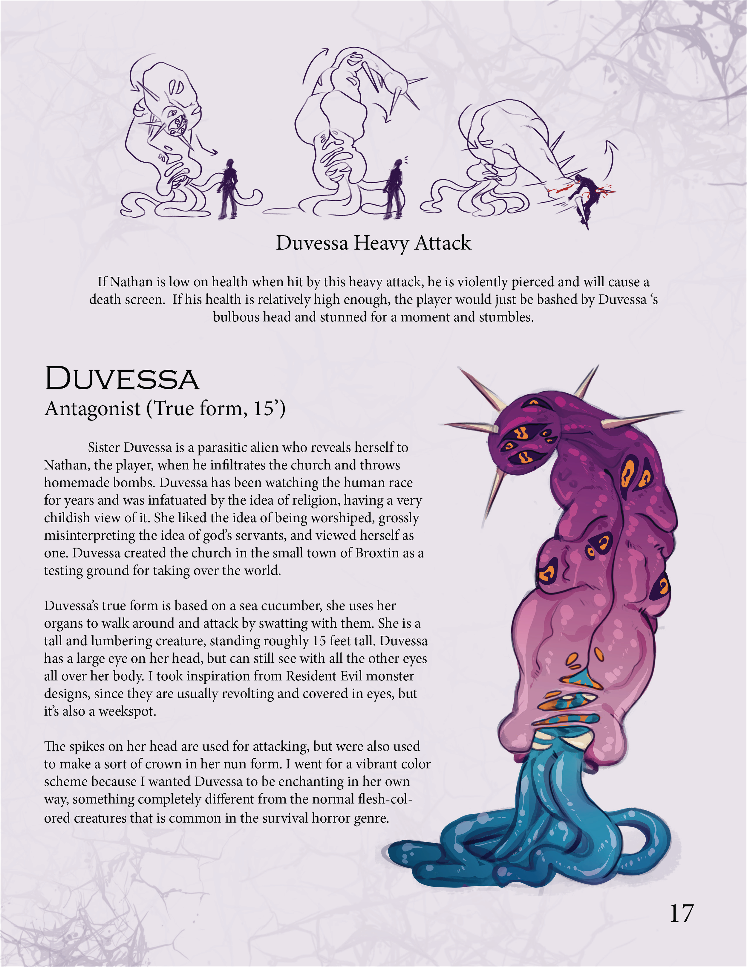
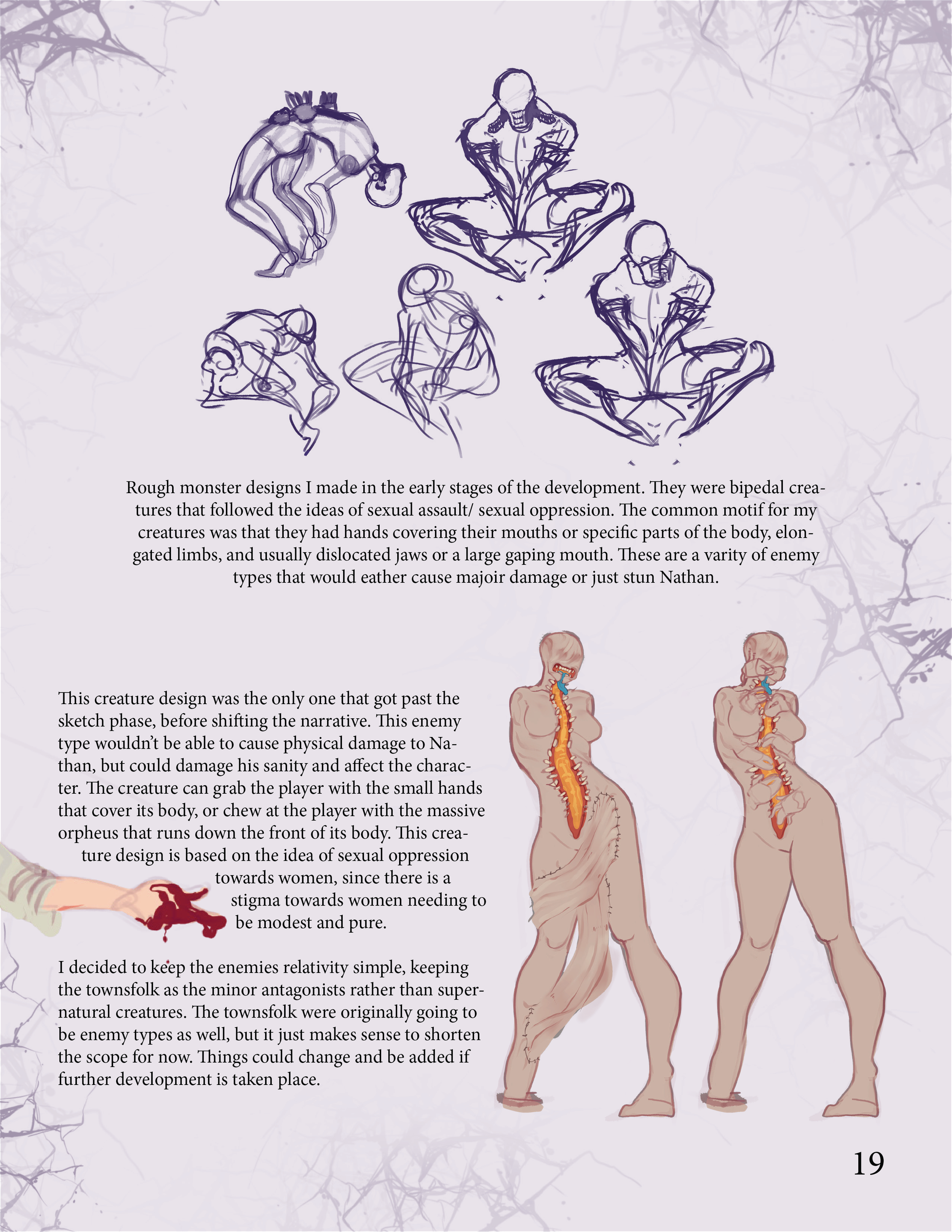
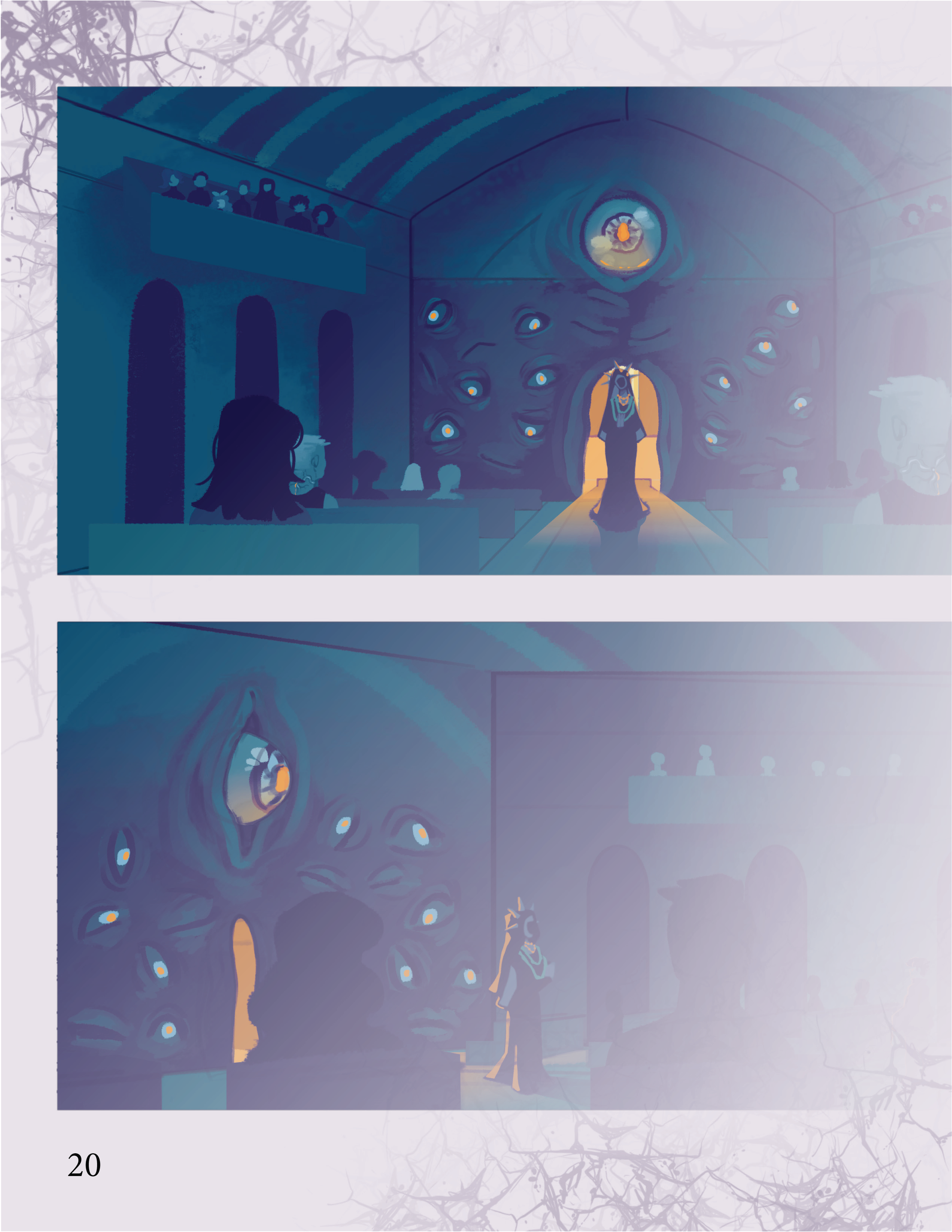
Condemned is heavily influenced by Matt Dymerski’s "The Church of the Sacred Way". This project aimed to renovate classic motifs in the horror genre. The common color palette for most horror media is plenty of greys, browns, and reds. I focused on depicting horror using an unconventional color scheme. The most dominant colors in “Condemned” are orange, blue, and purple. Medical diagrams that depict organs as unnaturally bright colors are one of my biggest inspirations when it comes to visual design choices for creature design.
Entry in Senior Show
This case study features my senior project “Condemned: Design Bible V.1”. The goal of this project was to break away from classic horror motifs of using dull grays by using a vibrant color palette. I love all forms of horror media, but I feel at times there is a lack of color that could really add to the emotions of a scene. Bright and high saturated colors can really add intense confusion and overstimulation to viewers that could help relate to what the protagonist is experiencing. This of course may not work with every horror game or film, but I feel that this could be another way to make views feel uncomfortable or frighten with what’s presented with unnatural colors.


